Introduction
Leading is a key element of typography that’s often overlooked by designers. It refers to the vertical distance between lines of type, and it can have a big impact on the overall look and feel of a design. In this guide, we’ll explore what leading is, the benefits of using leading in typography, and how to use leading to enhance your typographic designs.

Exploring the Role of Leading in Typography
Leading, also known as line spacing, is the space between lines of type. It’s measured in points, and it affects both the size of the type and the spacing between lines. By adjusting the leading, you can make text more readable or create more visual interest in your design.
How Leading Affects Type Size and Spacing
When it comes to type size and spacing, leading plays an important role. Generally speaking, the spacing between lines of type should be larger than the type size. For example, if you’re using 12-point type, the leading should be at least 14 points. If the leading is too small, the type will appear cramped and hard to read.
Adding Visual Interest with Leading
Leading can also be used to add visual interest to a design. By increasing the leading, you can create a more spacious look. This can be especially helpful when you’re working with long blocks of text. Increasing the leading can make the text easier to read and more visually appealing.
How to Use Leading to Enhance Your Typographic Design
Now that you understand the basics of leading, let’s take a look at how you can use it to enhance your typographic designs. Here are some tips for adjusting leading to perfectly space your type:
Understanding Baseline Grids
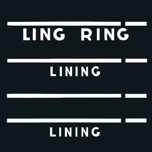
A baseline grid is an invisible grid of horizontal lines that helps to organize your type. Each line of type should align with one of the lines in the grid. This helps to ensure that your type is evenly spaced and looks professional. When adjusting the leading, you should always make sure that each line of type is aligned with the baseline grid.
Utilizing Guidelines in Your Design
Guidelines are another useful tool for organizing your type. You can use guidelines to create a consistent layout that looks professional. For example, if you’re creating a newsletter, you can use guidelines to keep the columns of text evenly spaced. This will help to ensure that your design looks clean and organized.
Adjusting the Vertical Spacing Between Lines
When adjusting the leading, you should also consider the vertical spacing between lines. The goal is to create a comfortable amount of white space between lines of type. Too much white space can make the text feel disconnected, while too little can make it feel cramped. The best way to find the right balance is to experiment with different leading values until you find the one that works best for your design.

A Comprehensive Guide to Understanding Leading in Typography
Leading is an important element of typography that can have a big impact on the overall look and feel of a design. To get the most out of leading, it’s important to understand the basics, as well as how to adjust it to create the perfect type spacing. Here’s a comprehensive guide to understanding leading in typography:
The Basics of Leading
Leading is the vertical spacing between lines of type. It’s measured in points, and it affects both the size of the type and the spacing between lines. Generally speaking, the spacing between lines of type should be larger than the type size. For example, if you’re using 12-point type, the leading should be at least 14 points.
Creative Ways to Utilize Leading in Typography
Leading can be used to add visual interest to a design. By increasing the leading, you can create a more spacious look. This can be especially helpful when you’re working with long blocks of text. You can also use leading to adjust the vertical spacing between lines to create a comfortable amount of white space.
Understanding Different Font Families and Their Impact on Leading
Different font families have different characteristics that can affect the leading. For example, some fonts are designed to be slightly condensed, which means they require less leading. Others are designed to be slightly expanded, which means they require more leading. It’s important to consider the characteristics of the font family you’re using when adjusting the leading.
Conclusion
Leading is an important element of typography that can have a big impact on the overall look and feel of a design. By understanding the basics of leading, exploring the role it plays in typography, and learning how to use leading to enhance your typographic designs, you can create beautiful, professional-looking designs.
In conclusion, leading is an important part of typography that can be used to create visually appealing designs. With the right understanding of leading and an eye for detail, you can use leading to create stunning typographic designs that stand out from the crowd.
(Note: Is this article not meeting your expectations? Do you have knowledge or insights to share? Unlock new opportunities and expand your reach by joining our authors team. Click Registration to join us and share your expertise with our readers.)
