Introduction
When it comes to design, color plays a major role in making a statement. From fashion to home décor, the right color combinations can make all the difference between an uninspiring piece and a stunning one. But how do you know what colors go well together? This article will explore the basics of color theory and provide 10 color palettes to get you started.
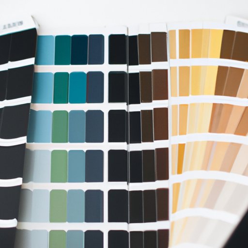
Color Wheel Combinations: Exploring the Basics of Color Theory
When trying to find the perfect color combination, it’s important to understand the basics of color theory. The color wheel is a tool used by artists and designers to identify which colors work best together. It consists of primary, secondary, and tertiary colors that are arranged in a circle.
Color Wheel Basics
The color wheel was developed by Sir Isaac Newton in 1666 and is based on the three primary colors: red, blue, and yellow. These colors are called primary because they cannot be created by mixing any other colors together.
Primary and Secondary Colors
These primary colors can be combined to create secondary colors, such as orange (red + yellow), green (yellow + blue), and purple (blue + red). Secondary colors are created when two primary colors are mixed together.
Tertiary Colors
Tertiary colors are created when a primary and a secondary color are mixed together. For example, when red and orange are mixed, the result is a tertiary color called red-orange. There are six tertiary colors: red-orange, yellow-orange, yellow-green, blue-green, blue-purple, and red-purple.

The Psychology of Color Combinations: Creating Visual Interest with Color
Now that you have a basic understanding of the color wheel, let’s explore the psychological effects of color on viewers. Different colors can evoke different emotions, and when used in combination, these colors can create a powerful visual effect.
Psychological Effects of Color on Viewers
A study conducted by the University of Loyola Marymount found that “warm” colors, such as red, yellow, and orange, are associated with energy and excitement, while “cool” colors, such as blue and green, are associated with calmness and relaxation. Additionally, according to a study conducted by researchers at the University of British Columbia, certain colors can also influence people’s behavior. For example, the study found that people are more likely to purchase items when they are displayed on a blue background.
Examples of Color Combinations to Achieve Desired Effects
Once you understand the psychological effects of color, you can use this knowledge to create visual interest with color. Here are some examples of color combinations to achieve desired effects:
- For a calming effect, try a monochromatic blue color scheme.
- For a vibrant and energetic look, combine bright shades of yellow and orange.
- For a sophisticated look, pair navy blue with light gray.
- For a modern and contemporary look, combine black with shades of white.
Monochromatic and Analogous Color Schemes
Now let’s take a look at two popular color schemes: monochromatic and analogous.
What is a Monochromatic Color Scheme?
A monochromatic color scheme is created when only one color is used in various shades and tints. This type of color scheme creates a harmonious and unified look.
What is an Analogous Color Scheme?
An analogous color scheme is created when three adjacent colors on the color wheel are used. This type of color scheme creates a pleasing and balanced look.

Harmonious Hues: How to Use Complementary Colors
Complementary colors are opposite each other on the color wheel and can create a striking and eye-catching effect when used together.
What are Complementary Colors?
Complementary colors are opposite each other on the color wheel and can create a striking and eye-catching effect when used together. For example, red and green, blue and orange, and yellow and purple are all complementary colors.
Examples of Complementary Color Schemes
Here are some examples of complementary color schemes to try:
- Red and green
- Blue and orange
- Yellow and purple
- Black and white
Triadic Color Schemes: Using Primary, Secondary, and Tertiary Colors
A triadic color scheme is created when three colors that are equally spaced apart on the color wheel are used. This type of color scheme creates an eye-catching and vibrant look.
What is a Triadic Color Scheme?
A triadic color scheme is created when three colors that are equally spaced apart on the color wheel are used. This type of color scheme creates an eye-catching and vibrant look.
Examples of Triadic Color Schemes
Here are some examples of triadic color schemes to try:
- Red, yellow, and blue
- Orange, green, and purple
- Yellow-orange, blue-green, and red-purple

Brighten Up Your Home with Color Blocking
Color blocking is a popular design trend that involves using blocks of color to create a visually interesting look. This type of color scheme can be used to add a pop of color to a room or to create a cohesive look.
What is Color Blocking?
Color blocking is a design trend that involves using blocks of color to create a visually interesting look. This type of color scheme can be used to add a pop of color to a room or to create a cohesive look.
Examples of Color Blocking
Here are some examples of color blocking to try:
- Pair bright red with navy blue for a bold and eye-catching look.
- Add a touch of whimsy by combining pink and yellow.
- Create a classic and timeless look by pairing navy blue and white.
- Go for a modern and minimalist look by using shades of gray.
10 Color Palettes to Try in Your Next Design Project
To help you get started, here are 10 color palettes to try in your next design project.
Color Palette #1
Light blue, navy blue, and white.
Color Palette #2
Mint green, peach, and cream.
Color Palette #3
Mustard yellow, dark green, and white.
Color Palette #4
Light pink, hot pink, and fuchsia.
Color Palette #5
Lavender, dusty blue, and pastel pink.
Color Palette #6
Coral, olive green, and navy blue.
Color Palette #7
Teal, mustard yellow, and white.
Color Palette #8
Lime green, navy blue, and light gray.
Color Palette #9
Maroon, pale pink, and white.
Color Palette #10
Burnt orange, teal, and gray.
Conclusion
Understanding the basics of color theory and psychology of color can help you create beautiful and eye-catching designs. With the right color combinations, you can take your projects to the next level. We hope this article has given you some ideas for how to use color in your next project.
(Note: Is this article not meeting your expectations? Do you have knowledge or insights to share? Unlock new opportunities and expand your reach by joining our authors team. Click Registration to join us and share your expertise with our readers.)