Introduction
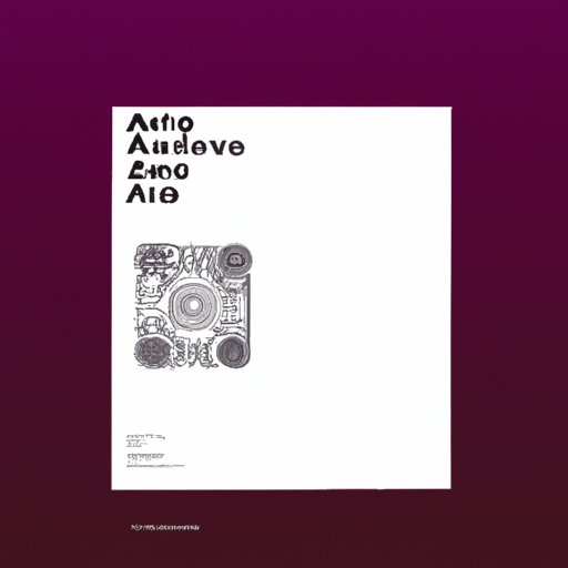
Cover art is an essential part of any musical project. It’s the first thing people see when they come across your music, so it’s important to create something that stands out and reflects the sound of your music. But creating professional cover art can seem like a daunting task. In this article, we’ll explore what makes great cover art, the tools and software available, and tips for optimizing your design for digital platforms.
What Makes Great Cover Art?
The best way to get inspired is to look at popular album covers. Take note of the design elements that make them stand out. Do they have bright colors? Interesting typography? A unique image? Once you have a better idea of what you want your cover art to look like, you can start to form a plan of action.
When creating a cover art design, there are a few basics to keep in mind. First, keep it simple. Too much complexity can be distracting and detract from the overall design. Second, choose colors that complement each other and reflect the mood of your music. Third, use fonts that are easy to read and appropriate for the genre. Finally, make sure all the elements work together harmoniously.

Tools and Software for Creating Cover Art
There are many tools and software available for creating cover art. Adobe Photoshop and Illustrator are two of the most popular, but there are also plenty of free options such as Canva and GIMP. Each program has its own features and advantages, so try several to find the one that works best for you.
Choosing Colors, Fonts, and Images
When choosing colors, fonts, and images, it’s important to think about the overall feel of the design. For example, if your music is upbeat and energetic, you might choose bright, vibrant colors. If it’s more mellow and introspective, you could opt for muted tones. When selecting fonts, make sure they’re easy to read and fit with the style of your music. And when picking images, choose ones that are high-quality and relevant to your sound.
Using Typography to Create an Eye-Catching Design
Typography is an important element of cover art design. You can use different font sizes and weights to draw attention to certain words or phrases. You can also play around with spacing and alignment to add interest to the design. Just remember to keep it legible and don’t go overboard with too many fonts or sizes.
Optimizing Your Cover Art for Digital Platforms
Once you’ve created your cover art, it’s important to optimize it for digital platforms. Different platforms have different requirements for size and resolution, so make sure to check the guidelines before uploading your design. Additionally, you should save your design in both RGB and CMYK formats, as some platforms require one or the other.
Conclusion
Creating professional cover art for music doesn’t have to be intimidating. With the right tools, techniques, and resources, you can create something unique and eye-catching. Start by researching popular album covers and familiarizing yourself with the basics of design. Then, choose the right colors, fonts, and images, and use typography to add interest to your design. Finally, optimize your cover art for digital platforms and you’re ready to go.
For more tips and advice on creating professional cover art, check out our blog. We cover everything from design basics to advanced techniques.
(Note: Is this article not meeting your expectations? Do you have knowledge or insights to share? Unlock new opportunities and expand your reach by joining our authors team. Click Registration to join us and share your expertise with our readers.)
